Transform Storius :
A Map and Audio Experience Revamp
From Standalone Stories to Multi-Stop Guided Tours
Role: UX Designer | Duration: 3 Months
Team: 2 UX/UI Designers, 3 Engineers, 4 Business/Content Strategiest
Responsibilities
-
On-site User Observations
-
Usability Testing and Analysis
-
Design Prototypes and Product Iterations
-
Final Design Handoffs to Engineers

Summary
Storius is an audio-guided travel app, allowing users to explore cultural stories on Map, with seamless audio playback.
However, as the company partnered with tourism boards and cultural advocacy organisations, it shifted from standalone stories to curated tours—multi-stop journeys connecting related stories.
To handle the increased complexity, we conducted on-site observation and usability testing to understand user insights and internal constraints. The redesigned Map Experience improved navigation clarity, action feedback, and audio-visual interaction, aligning with both user engagement and business goals.
Background
The original Storius experience was built for single-story discovery, where a user tapped a pin, preview, listened, and moved on.

But the introduction of Tours added layers of complexity. Unlike individual stories, Tours required users to follow a structured path, navigate multiple pins within, and manage audio playback simultaneously.
Faced with these challenges, our team began asking key question:
“How might we integrate complex tour features while keeping navigation simple and smooth?”
Design Process
Research: On-site Observations & Usability Testing
To understand users’ real-world behaviours and pain points, we collaborated with the Content Team to host cultural tours where users navigated along with our app.

* Photos and Instagram Posts where we promote our free guided tour and seek participants
Synthesis: Identifying Usability Insights & Constraints
We identified three key usability issues, along with their underlying technical constraints upon discussion with engineers:
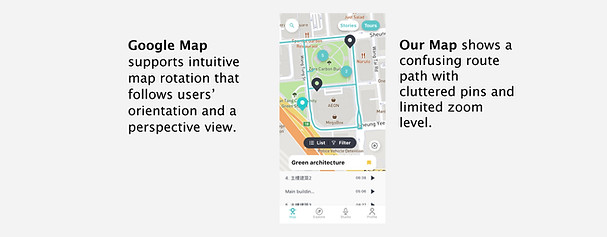
Insight #1 - Lack Intuitive Navigation on built-in Map
-
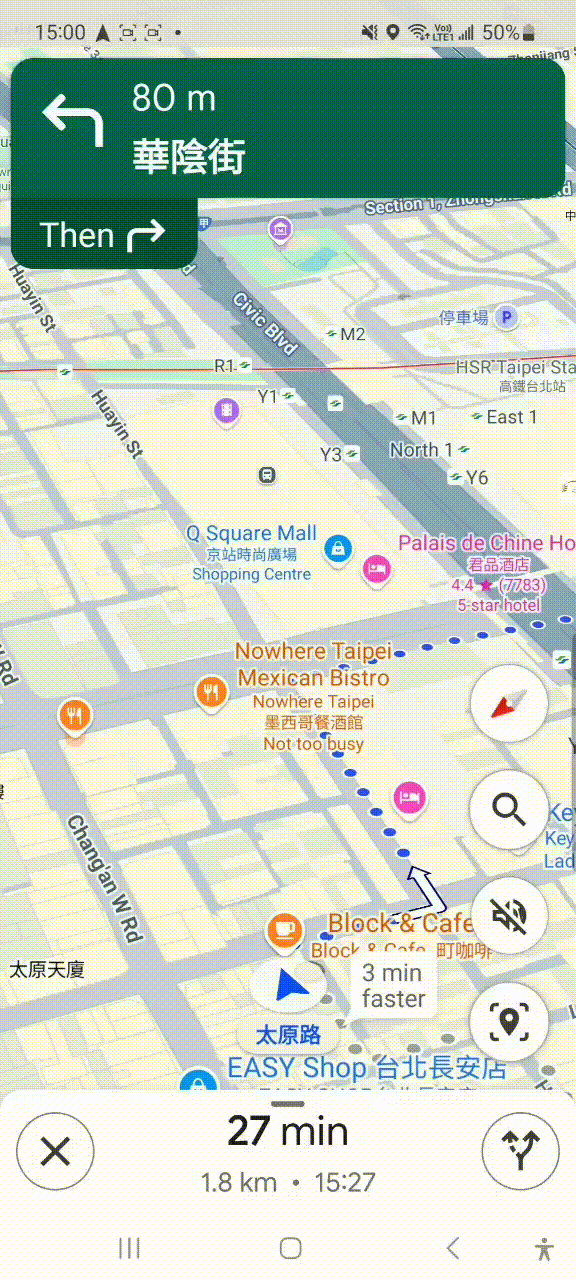
Issues: Upon identifying location, users soon turned to Google Map to navigate their way.
-
Constraints: Budget limitations required reliance on a simpler API instead of Google Maps, making some advanced navigation features unfeasible.
Insight #2 - Multi-Tasking Expectations and Tags Complicated by Tours
-
Issues: Users naturally multitask, such as previewing unrelated content while listening to audio.

-
Constraints: The original data structure, optimised for standalone stories, lacked flexibility to support Nested Tags for Tours (if containing stories of varied premium access rules, themes, or visibility).

Insight #3 - Action-Response Mismatch
-
Issues: Users were confused by inconsistent system responses when:
-
Triggering changes to Only Audio, Only Visuals, or Both.
-
Expecting to Remain on Map for content preview v.s. Switch to Detailed View for focused descriptions.
-
Design Strategies
We therefore define three core design goals, building upon each other to address Fundamental Usability Needs to Far-reaching Opportunities:

Final Design
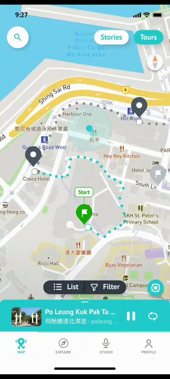
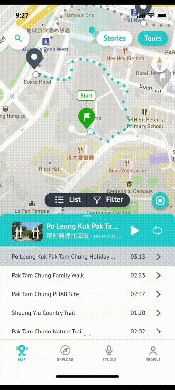
Feature #1 - Visual Guidance and Tour Route Indication

Feature #2 - Multi-tasking by parallel Audio-Visual control
-
Expand Mini-player to Playlist for precise audio control while staying on Map
-
Swipe for Audio Script, meeting users’ occasional need of following along
Feature #3 - Adaptive Visibility balancing: Focus on Current v.s. Suggest the Next

Results
Business Impact
The revamp, driven by business expansion goals, provided increased exposure for partners through curated Tour content, aligning with the company's growth strategy, while balancing internal technical constraints.
User Experience
Iterative design based on user insights streamlined map navigation by reducing friction, offering clear action feedback, and encouraging continuous content exploration, enhancing overall user satisfaction.
Reflections
This project highlighted my role as a UX designer in balancing stakeholder needs with user experience and communicating across teams, especially during discussions.
Mini-player v.s. Map View
Some team members pushed to remove the mini-player for a larger map view. I advocated against this, as it would leave users feeling lost and reduce their control over audio playback, which they valued. Communicating this to the team was crucial in ensuring the navigation freedom for both Map and audio control.
Mini-player Premium Feature Conflict
Introducing premium features clashed with our partners’ existing exclusive content, risking user confusion with complex access rules. I communicated these concerns and successfully delayed the premium feature rollout to maintain a simpler, user-friendly experience.